case study
Nursing Home financing Calculator
User-friendly interface facelift for the welfare calculator
My role
Ux Strategy, Reasearch, UX/UI
The client
Israeli health organization
Team
Malam Team, studio pionet
Overall timeline
8 + weeks
Discovery & Research: 2+ weeks
Design & testing: 6 weeks
The Challenges
The old version of the calculator had these issues:
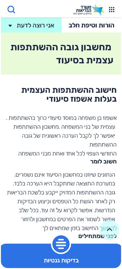
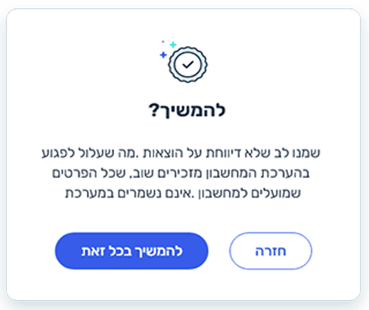
Simulation and Payment Information:
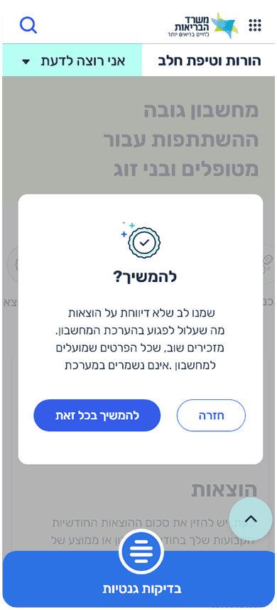
Emphasis on the simulation nature of the tool. Mention of the simulation being for payment purposes. Importance of understanding what the calculator does.
Text Uniformity and Structure:
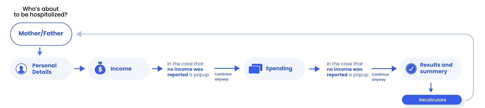
Efforts to maintain consistency in the application's text. Comparison to the previous text (single, myself/partner, mother/father).
User Understanding and Experience:
Difficulty understanding instructions. Lack of clarity about the context and purpose. Uncertainty about calculations for self or someone else. Confusion in choosing between parent or child. Lack of understanding about the calculator's functionality.
Overview
Role : Lead Designer
When : October 2022 - July 2023
Platform : B2B - SaaS Website and Mobile App
Responsibilities : UX Research, UI Audit, User Testing, Prototyping, Documentation
Key Deliverables :UX AuditUser FlowsWireframes & PrototypesStyle guide and tokenizationComponent LibraryDesign System Documentation
Main Goals
System pages

Mobile design
Research & insight
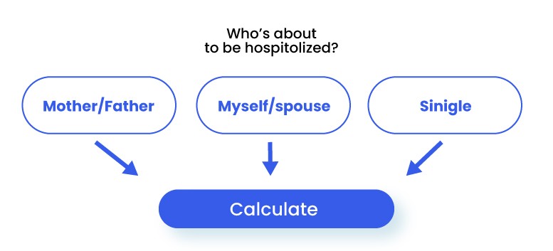
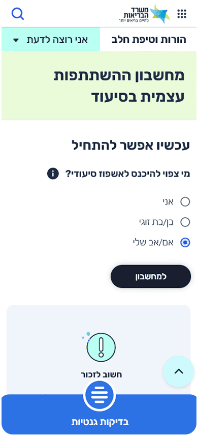
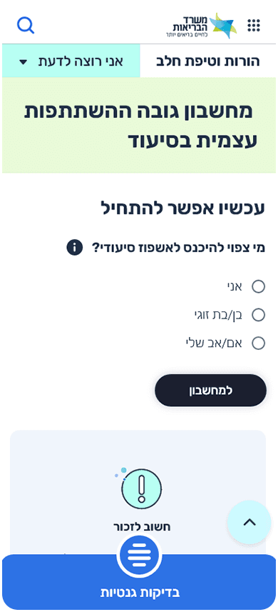
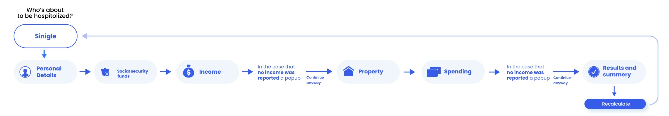
3 flow versions for the calculator were created for each catagorie (single, myself/partner, mother/father).

Style Guide

uI components
Reflection
Measure Success
In order to understand if my solution was right & applicable, I needed to see if there are ways to measure success. Here are the main ones:Reduction in over-tourism - If we could see some changes in the overload cause by the app, this would be a huge success.Vacation plan completion rate - If the users will complete the vacation according to the plan.In app purchases rate - The amount of users buying tickets, flights and reserve hotels via the app
The website brings value to its users, and therefore will also increase business. But not only that,
Final thoughts
My collaboration with the Israeli internal affeirs office has resulted in a revitalized system that not only aligns with the organization's prestigious designation but also serves as an effective platform for communication, resource-sharing, and employees engagement.