case study
International Health Risks Mapping System
New interface for International health
risks mapping system
My role
Ux Strategy, Reasearch, UX/UI
The client
Israeli health organization
Team
Malam Team, studio pionet
Overall timeline
8 + weeks
Discovery & Research: 2+ weeks
Design & testing: 6 weeks
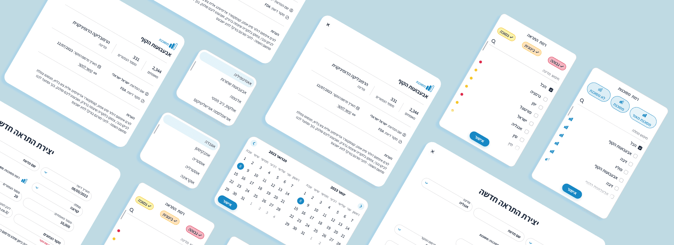
Map design
The Challenges
I Was Tasked In Creating An Interactive Interface For The Mapping Of Diseases Globally. "The Risk Management Map", Must Show Clearly The Illnesses, Pandemics, Assist In The Analyzation Of Them Worldwide.
The UI/UX design should follow conventional design principles while incorporating modern elements and trends. the map should reflect the brand identity and maintain consistency with the overall system.
Main Goals
World Map Display:
UI Component: Interactive world map with zoom and pan functionality.
Disease Representation:
UI Component: Icons or markers on the map representing different diseases. Each icon should be clickable.
Data Visualization:
UI Component: Graphs, charts, or visualizations providing insights into the spread and impact of diseases.
Search and Filter:
UI Component: Search bar and filters to locate specific diseases or analyze data based on criteria such as region, severity, or time.
Reporting Mechanism:
UI Component: Reporting form allowing users to add new diseases. Include fields for disease name, origin, spread information, and reporter details.
Information Panel:
UI Component: Display panel providing detailed information about selected diseases, including origin, affected areas, and any available preventive measures.
Research & insight

Yael rubin
Public Health Analyst
Yael holds a master's degree in Public Health and has been working as a public health analyst for the Israeli Health Organization for the past five years.
Behaviors
Yael has a keen interest in global health issues and has experience in analyzing and interpreting health data. Yael is known for her attention to detail and her ability to translate complex health information into user-friendly visuals.
Challenges
Data Accuracy:
Yael is concerned about the accuracy of the reported data. Ensuring that users provide reliable information is crucial for effective disease monitoring.
User-Friendly Interface:
Yael acknowledges the diverse user base, including individuals with varying levels of technical proficiency. The platform needs to be intuitive and user-friendly to encourage active participation.
Pain points
Real-time Updates:
Yael requires real-time updates to respond promptly to emerging health threats. Delays in data reporting and visualization could hinder the organization's ability to take timely actions.
Privacy and Security:
Yael is mindful of the sensitive nature of health data. The platform must prioritize privacy and security measures to protect user information and comply with relevant regulations.
Devices


Apple, ipad pro.
Planning schedule & meetings.
moodboard for presentations.
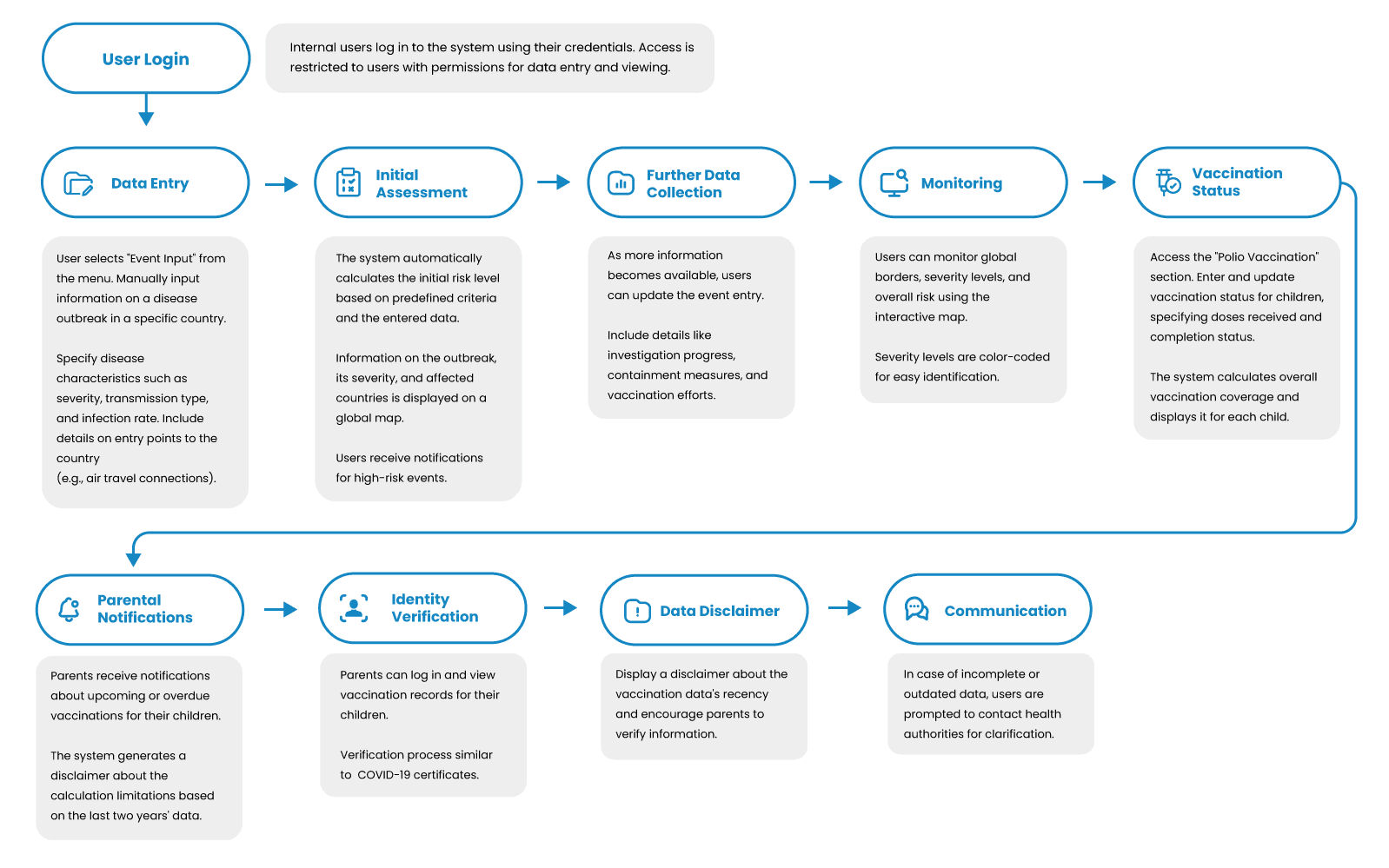
User journey
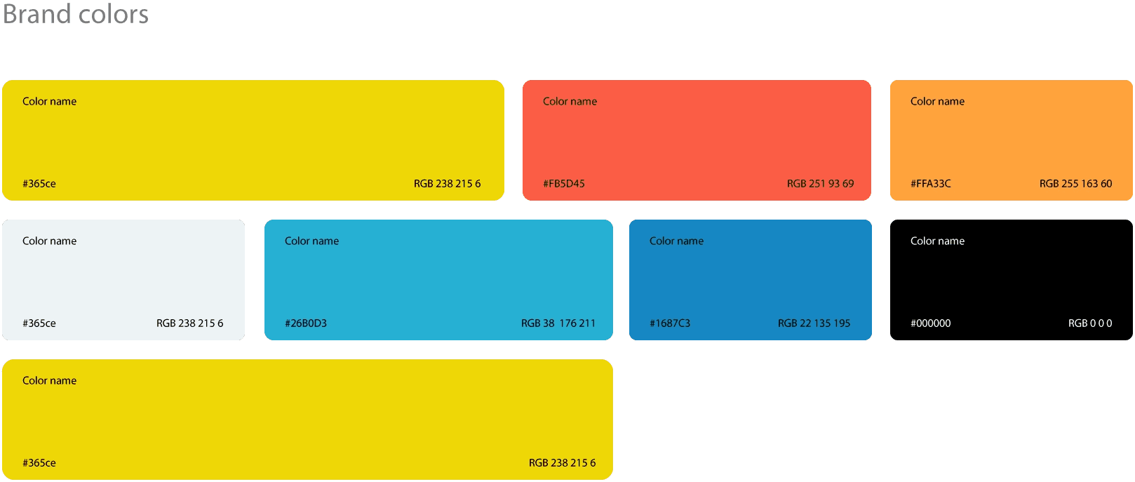
Style Guide
Reflection
Measure Success
In order to understand if my solution was right & applicable, I needed to see if there are ways to measure success. Here are the main ones:Reduction in over-tourism - If we could see some changes in the overload cause by the app, this would be a huge success.Vacation plan completion rate - If the users will complete the vacation according to the plan.In app purchases rate - The amount of users buying tickets, flights and reserve hotels via the app
The website brings value to its users, and therefore will also increase business. But not only that,
Final thoughts
I did a mini-research, flow diagram, and created hi-fi designs. My collaboration with the Israeli Health Organization has resulted in the creation of a great ui for the map and i received positive feedback from users and the client.