case study
Election Funds Management System
Redesign of the Election funds management system for the Israeli Ministry of Internal Affairs
My role
Ux Strategy, Reasearch, UX/UI
The client
Israeli health organization
Team
Malam Team, studio pionet
Overall timeline
8 + weeks
Discovery & Research: 2+ weeks
Design & testing: 6 weeks
The Challenges
I was tasked with redesigning the interface of the old Election Funds Management System, after reviewing the existing system i found these issues that needed
to be solved
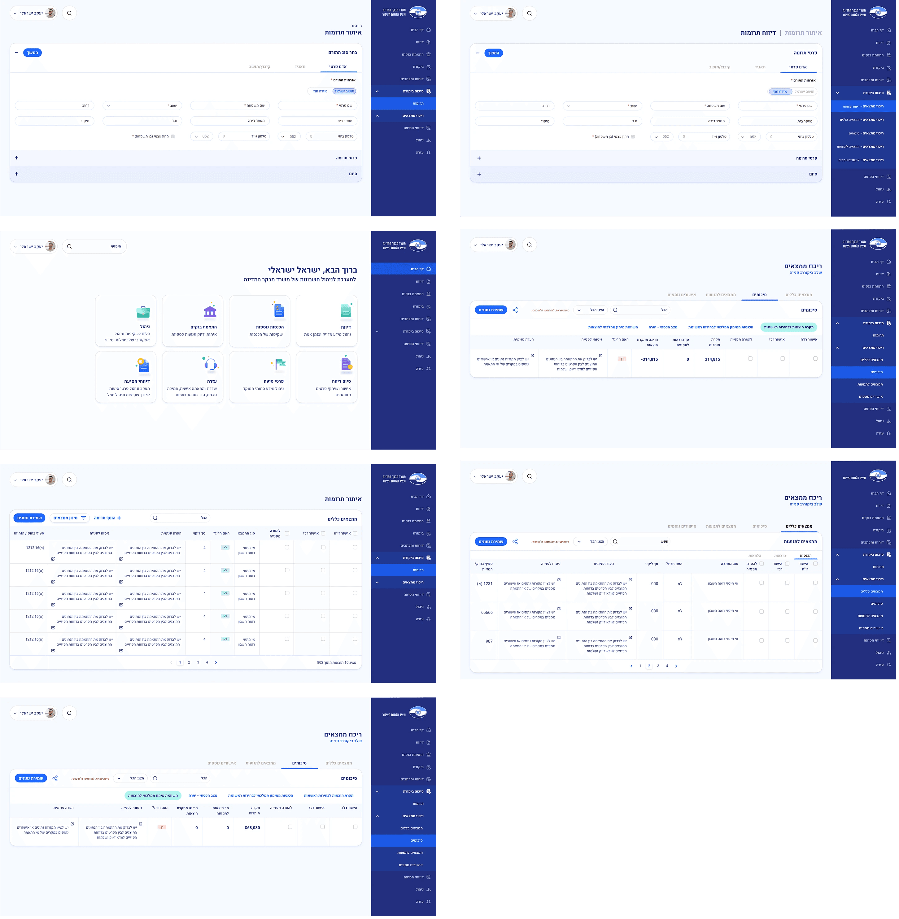
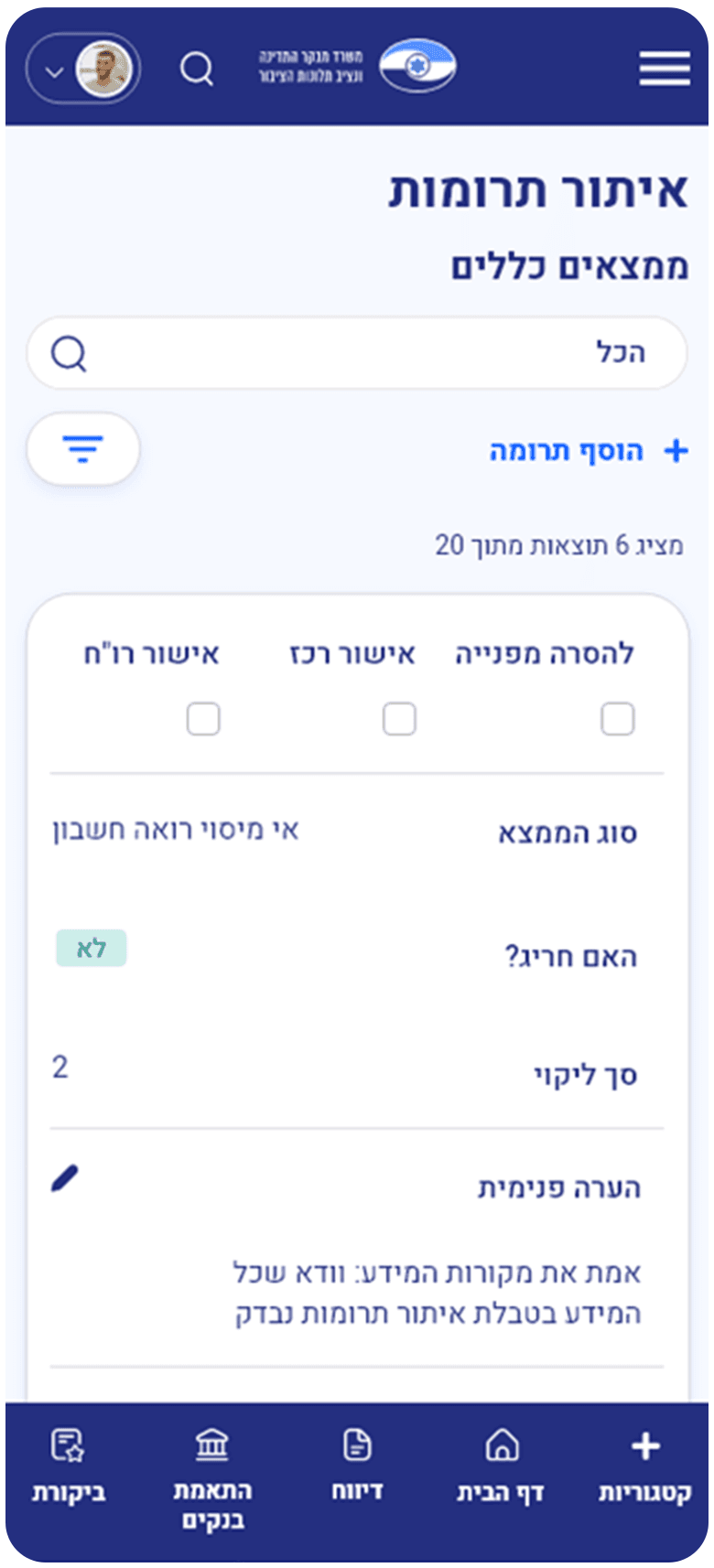
The Election Funds Management System is a system that monitors and manages the electorial funds and donations
Main issues in the old design:
Flow that consisted of screens that led nowhere in the website
Outdated design
Lack of clarity and hierarchy within the ui design
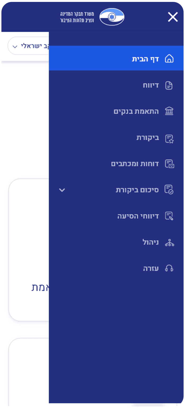
Too many popup menus
Overview
Role : Lead Designer
When : October 2022 - July 2023
Platform : B2B - SaaS Website and Mobile App
Responsibilities : UX Research, UI Audit, User Testing, Prototyping, Documentation
Key Deliverables :UX AuditUser FlowsWireframes & PrototypesStyle guide and tokenizationComponent LibraryDesign System Documentation
Main Goals
Minimize Pop-ups: Reduce the use of pop-up dialogs and notifications, opting for more user-friendly ways to convey information or gather input.
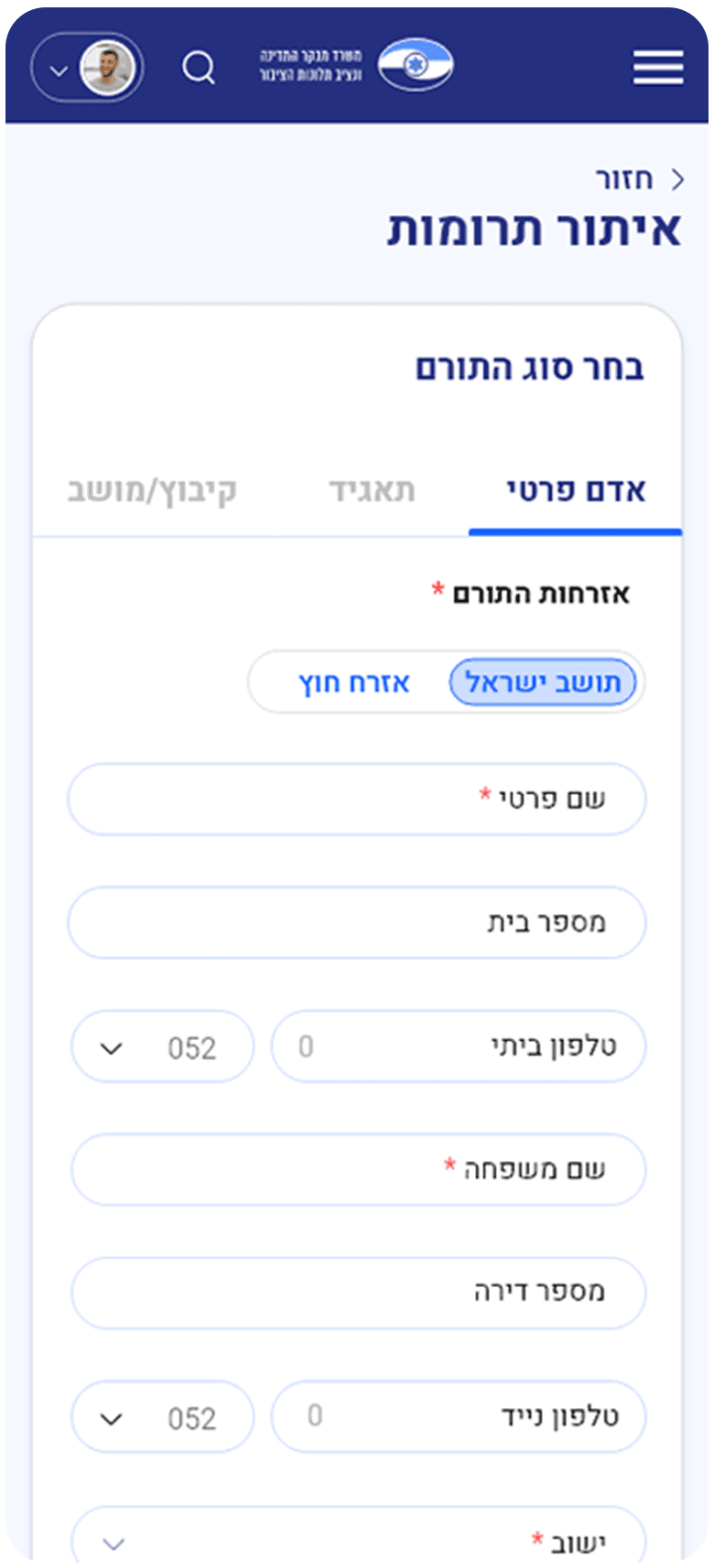
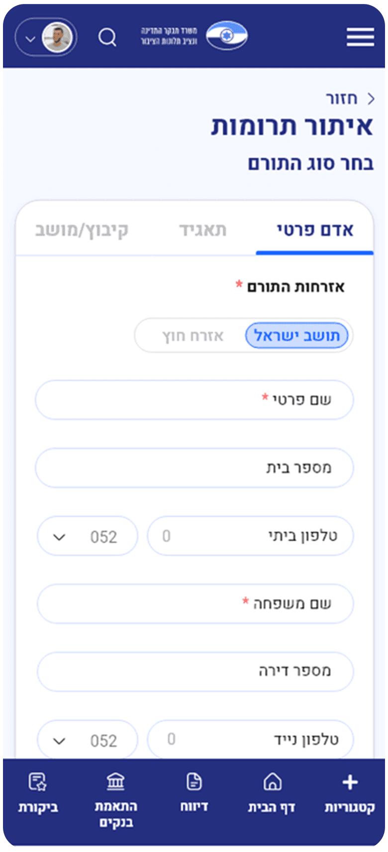
Streamlined Forms: Simplifyed and consolidated the forms, eliminating unnecessary fields and reducing user input
time.
Consistency: Maintain a consistent design and interaction pattern throughout the system to reduce cognitive load and improve usability.
Simplified User Flow: i will Create a more intuitive and logical flow for users to perform tasks efficiently and with minimal effort.
Modern and Clean UI: a visually appealing and contemporary user interface that aligns with current design trends, enhancing user engagement and satisfaction.
Accessibility Improvements: Ensure that the redesigned system is accessible to all users, including those with disabilities, by adhering to web accessibility standards.
ata Transparency: Prioritize the presentation of financial data in a clear and understandable manner, making it accessible to both the public and auditors.
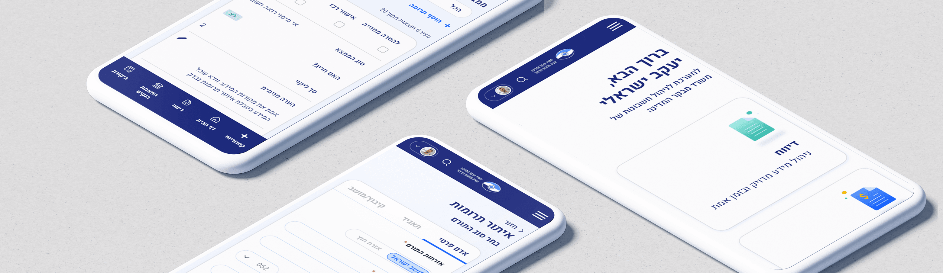
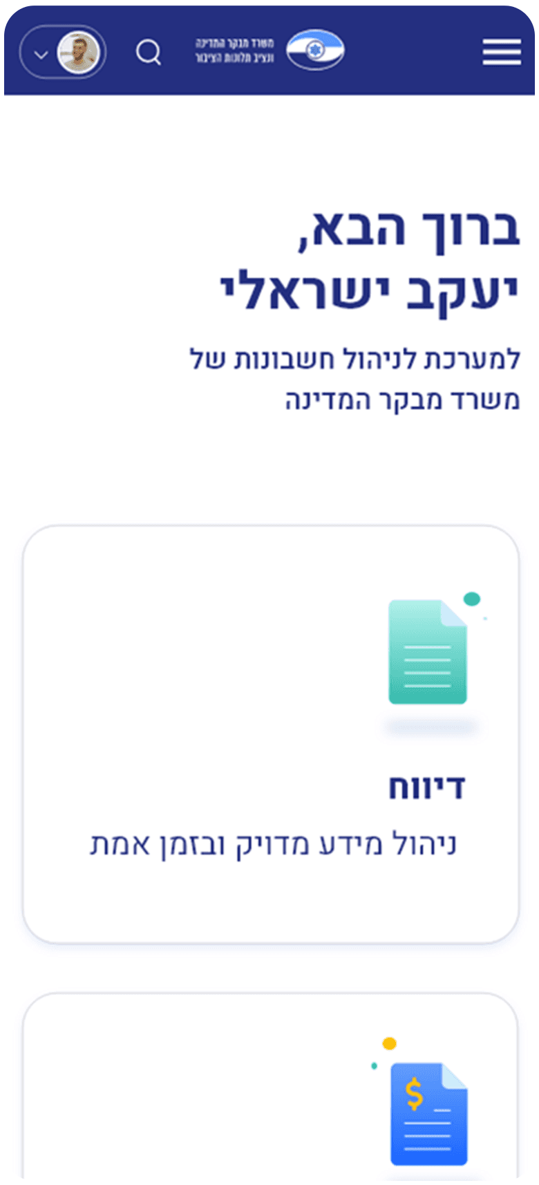
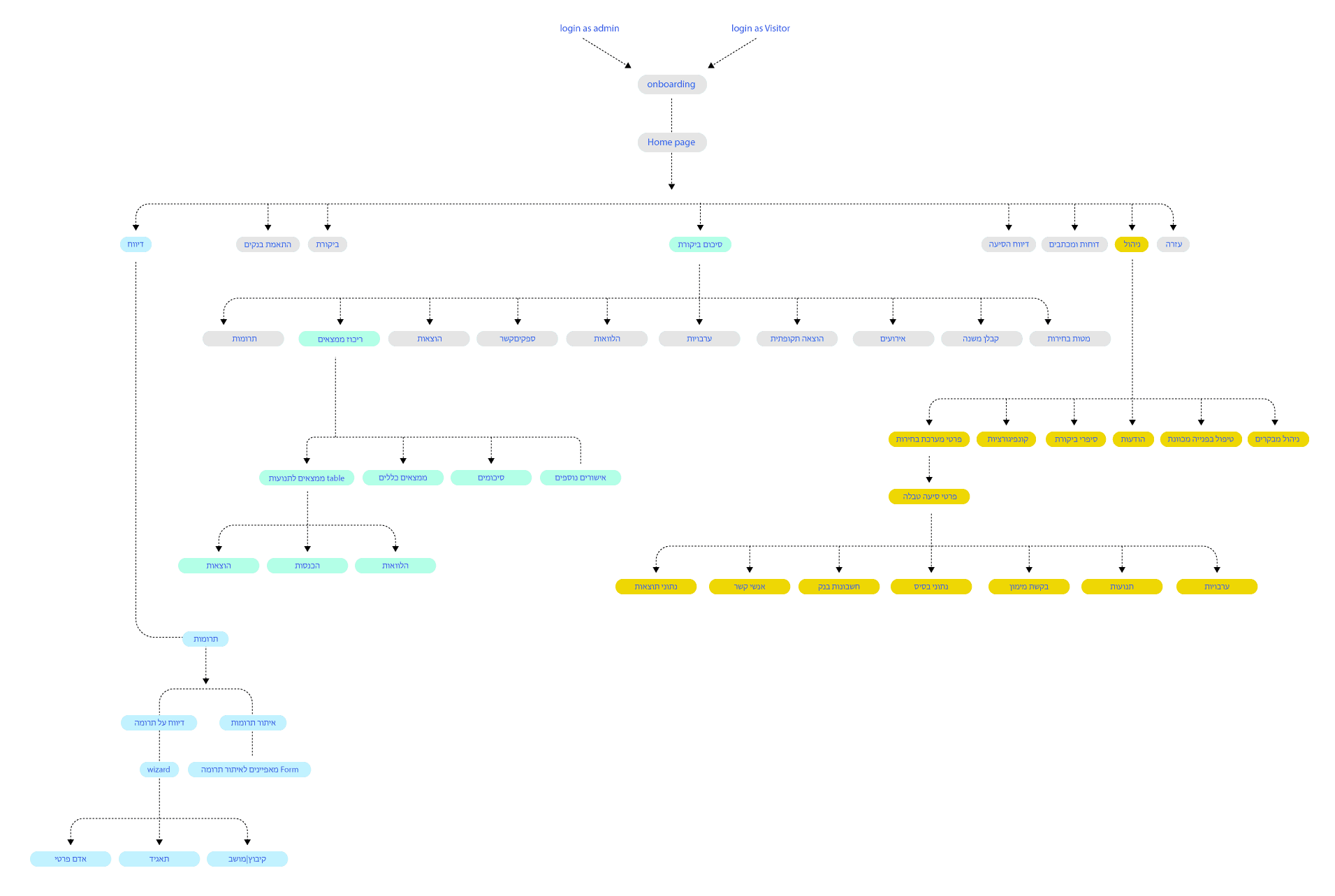
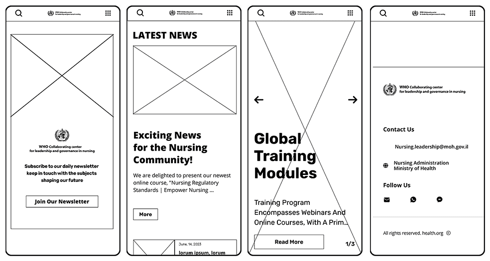
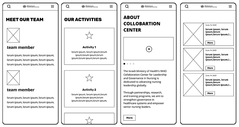
System pages
Mobile design
Research & insight

Amit Cohen
Digital Marketing Manager
Amit is a 34yr old dad based in tel aviv. he has worked for the goverment for a 7 years and is falimiliar with the old system
Behaviors
Staunch advocate for parties in Israeli politics. Technological Skillset: Intermediate, acquainted with prevalent digital resources. Personal Details: Marital Status: Wedded. Education: Obtained a Bachelor's Degree in the field of Political Science.
Challenges
Understanding complex regulations
Streamlining donation processes
Enhancing data security
Improving transparency
User-friendly interface design
Integration with existing systems
Training and support
Pain points
Access to donor lists and payment records
User-friendly interface for moderate tech users
Contribution management features
Privacy and security concerns
Understanding complex regulations
Streamlining donation processes
Enhancing data security
Improving transparency
User-friendly interface design
Integration with existing systems Training and support
Devices


Apple, ipad pro.
Planning schedule & meetings.
moodboard for presentations.
User journey
Wireframes

Hight Fidelity Wireframes
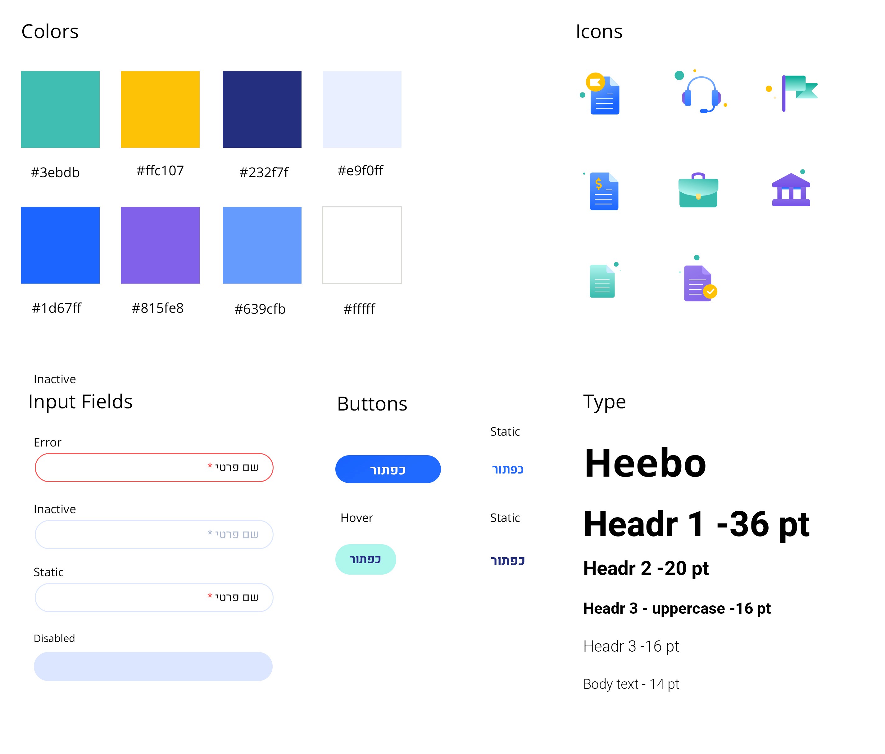
Style Guide
Reflection
Measure Success
In order to understand if my solution was right & applicable, I needed to see if there are ways to measure success. Here are the main ones:Reduction in over-tourism - If we could see some changes in the overload cause by the app, this would be a huge success.Vacation plan completion rate - If the users will complete the vacation according to the plan.In app purchases rate - The amount of users buying tickets, flights and reserve hotels via the app
The website brings value to its users, and therefore will also increase business. But not only that,
Final thoughts
My collaboration with the Israeli internal affeirs office has resulted in a revitalized system that not only aligns with the organization's prestigious designation but also serves as an effective platform for communication, resource-sharing, and employees engagement.